Trumpcare Takeaway: Stakeholders Matter

The main lesson we should take away from the failure of “Trumpcare” (or “Ryancare”) is the importance of stakeholders. When groups representing every type of stakeholder (medical professionals, hospitals, patients, and insurers) all came out against the American Health Care Act, its fate was pretty much sealed.

By now I think everyone can agree that the American Health Care Act (AHCA) was never intended as serious legislation. The utter failure of GOP lawmakers to consult with stakeholders, not just in the past two months, but at any point during the last seven years, made it clear from the beginning that they were not really interested in replacing the Affordable Care Act (ACA) with a real healthcare plan, so much as a political “win.”

In contrast, before voting on the ACA, Democrats spent nearly a year holding hearings, listening to experts, and getting buy-in from stakeholders (doctors, patients, hospitals, insurers).

RIP Trumpcare2

The Republican leadership’s bypassing of the legislative process not only shows disregard for the people they purport to represent, but it also reveals just how little many members of Congress know (or care) about basic economics, much less healthcare economics. After listening to hours of “debate” over the past few weeks, I’ve come to the conclusion that most Republican House members (and probably some Democrats) don’t have the first clue how our health insurance system actually works, much less how changing it might effect their constituents.

Contrary to Republican nostalgia, I don’t think most Americans want to move backwards. The ACA protections (no exclusion for pre-existing conditions, essential health services, no lifetime caps, yearly out-of-pocket maximums) are the new standard. No amount of extolling the “free market” and “freedom to chose” will convince people they are better off without these ACA protections. In fact, the more protections Republican leadership gave away, to try and win over the Freedom Caucus, the more they spooked moderates in their party who feared the political repercussions of taking healthcare away from their constituents. And rightly so. By Thursday only 17% of the public supported the AHCA. By cancelling the vote numerous Republican members of the House were saved from voting against the interest of their own constituents.

Over the past few weeks Republicans couched their opposition to the ACA in terms of “freedom.” What they failed to recognize is that yes, Americans want freedom—the freedom to not worry about how they’re going to pay for healthcare.

Infographics Part II: ACA Medicaid Expansion vs. AHCA Per Capita Caps

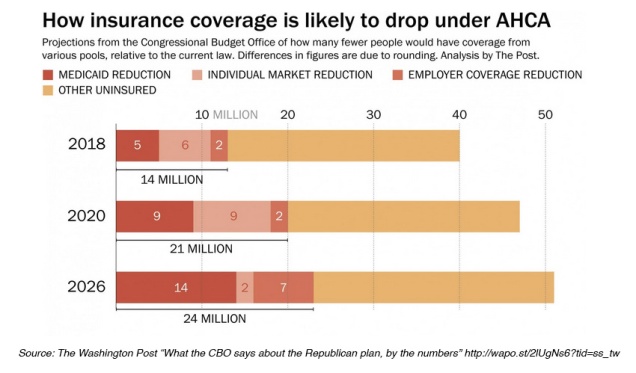
NYT CBO

Medicaid beneficiaries stand to lose the most under the American Health Care Act (AHCA). According to the new Congressional Budget Office Report, Medicaid recipients would make up a disproportionately large share of 24 million people expected to lose health insurance coverage by 2026 if the GOP legislation becomes law.

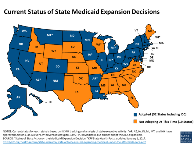
Under the Affordable Care Act (ACA) 32 states expanded Medicaid eligibility to low-income adults earning up to 138 percent of the poverty line (about $34,000 for a family of four). The AHCA, as currently written, continues expansion for three more years before cutting federal funding to state Medicare programs through a per capita cap, limiting coverage to those enrolled before 2020. Vox recently provided a good explanation of per capita caps as does the Kaiser Family Foundation.


current-status-of-the-medicaid-expansion-decisions-healthreform.png

Many of the best Medicaid infographics predate the release of the AHCA, but they still remain relevant to the current discussion. The KFF website includes a large collection of data on Medicaid expansion, including maps (like the image above) and detailed Medicaid State Fact Sheets.


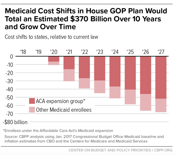
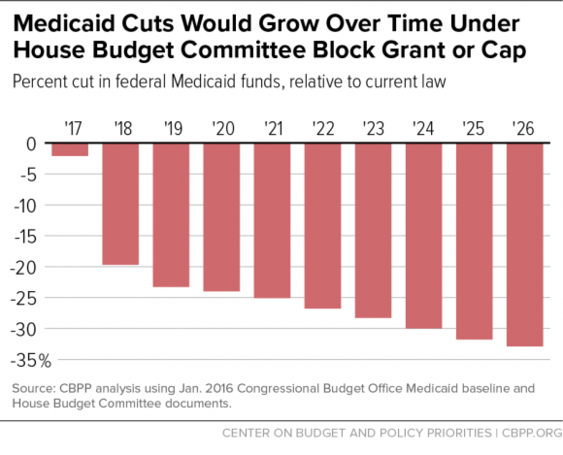
The Center on Budget and Policy Priorities (CBPP) produced the following charts estimating the costs to states of the per capita cap.

Medicaid Cost Shift CBPP

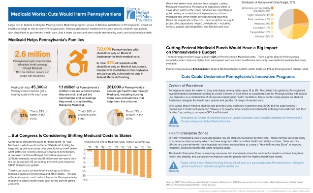
MEdiciad Cuts Growth OVer Time CBPPCBPP also created a series of fact sheets illustrating the effects of Medicaid cuts in nine different states. Here is the fact sheet for Pennsylvania:

PA Fact Sheet CBPP.jpg


Images in the slideshow below appear in The New York Times article “Republicans’ Changes to Medicaid Could Have Larger Impact Than Their Changes to Obamacare”

This slideshow requires JavaScript.


See Part I: Tax Credits vs. Premium Subsidies

Coming Soon:

Part III: Individual Mandate vs. Penalty for Break in Coverage

Part IV: Cost Comparisons

The Best Infographics Comparing the GOP’s Healthcare Plan with the Affordable Care Act

Part I: Tax Credits vs. Premium Subsidies

Infographics

In the week since the Republicans unveiled their Obamacare replacement plan multiple news outlets have  reported on what’s in the legislation, how it compares to the Affordable Care Act (ACA), who stands to benefit or lose, how much it will cost, etc.–many illustrated with helpful infographics.

Even if you follow the healthcare debate closely, the quantity of tables, graphs, and charts can quickly get overwhelming. After a while they all seem to look the same (actually, many are the same, or rely on the same data sources).

Want to know what’s in the American Health Care Act (AHCA) and how it might affect you and your community? We’ve compiled some of the best infographics from around the internet to help you make sense of it all.

Part I: Tax Credits vs. Premium Subsidies

One of the most significant changes in the GOP legislation is the replacement of premium subsidies (based on age, income, and geography) with age-and income-based tax credits, with no geographic variation. Several graphs from the Henry J. Kaiser Family Foundation (KFF) show how people of different ages and incomes fare under tax credits depending on where they live.(If you aren’t already familiar with the Henry J. Kaiser Family Foundation you should check out their website now.)

Their Interactive map provides county-and-state level comparisons of of ACA vs. AHCA tax credits  based on age and income level.

Note: To try it out, click on the picture below to go to the KKF site. Once the new page opens, scroll down a bit to find the interactive map.
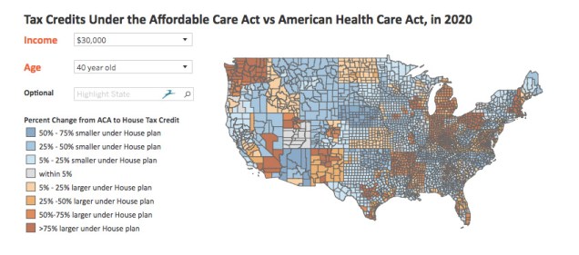
KFF interactive

A related KFF report, How Affordable Care Act Repeal and Replace Plans Might Shift Health Insurance Tax Credits, includes the following charts, illustrating the effects of the GOP plan’s tax credits on individuals and families in different age and income groups in high and low cost states.

This slideshow requires JavaScript.


Many prominent news outlets cite KFF as a source for their illustrations. For example, last week,  both The Los Angeles Times and The New York Times used similar graphics (in different colors) based on KFF data.

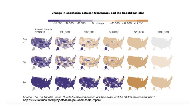
NYT maps_slideLATimes Graphics_Slide


Another good set of illustrations of how the GOP plan might affect individuals at different income levels is provided in an analysis by The Century Foundation.


For a state-by-state comparison, the waterfall graph (below) from The Center on Budget and Policy Priorities (CBPP) shows the difference between the average ACA subsidy and the proposed AHCA tax credit.
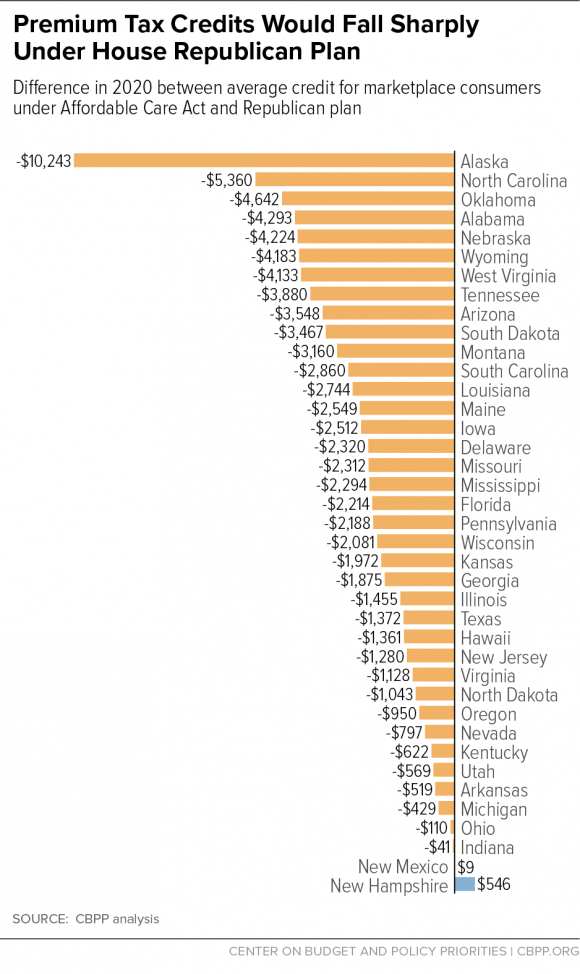
tax-credits-change-waterfall_450.png

Part II: Medicaid Expansion vs. Per Capita Cap

Coming Soon:

Part III: Individual Mandate vs. Penalty for Break in Coverage

Part IV: Cost Comparisons