If
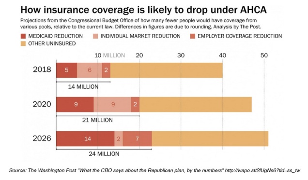
Medicaid beneficiaries stand to lose the most under the American Health Care Act (AHCA). According to the new Congressional Budget Office Report, Medicaid recipients would make up a disproportionately large share of 24 million people expected to lose health insurance coverage by 2026 if the GOP legislation becomes law.
Under the Affordable Care Act (ACA) 32 states expanded Medicaid eligibility to low-income adults earning up to 138 percent of the poverty line (about $34,000 for a family of four). The AHCA, as currently written, continues expansion for three more years before cutting federal funding to state Medicare programs through a per capita cap, limiting coverage to those enrolled before 2020. Vox recently provided a good explanation of per capita caps as does the Kaiser Family Foundation.
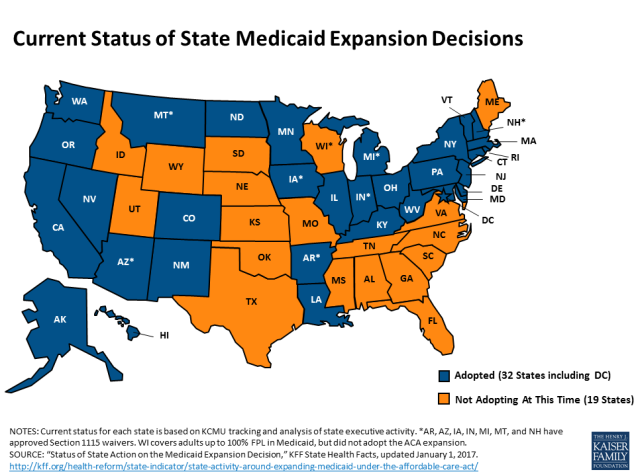
Many of the best Medicaid infographics predate the release of the AHCA, but they still remain relevant to the current discussion. The KFF website includes a large collection of data on Medicaid expansion, including maps (like the image above) and detailed Medicaid State Fact Sheets.
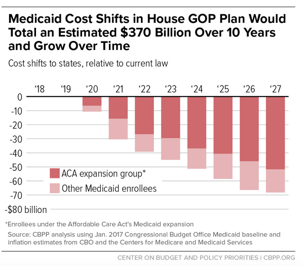
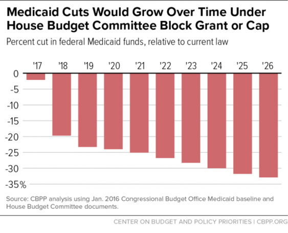
The Center on Budget and Policy Priorities (CBPP) produced the following charts estimating the costs to states of the per capita cap.
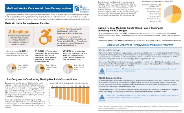
 CBPP also created a series of fact sheets illustrating the effects of Medicaid cuts in nine different states. Here is the fact sheet for Pennsylvania:
This slideshow requires JavaScript.
Coming Soon:
Part III: Individual Mandate vs. Penalty for Break in Coverage
Part IV: Cost Comparisons
