Repeal and Replace
Infographics Part II: ACA Medicaid Expansion vs. AHCA Per Capita Caps
Medicaid beneficiaries stand to lose the most under the American Health Care Act (AHCA). According to the new Congressional Budget Office Report, Medicaid recipients would make up a disproportionately large share of 24 million people expected to lose health insurance coverage by 2026 if the GOP legislation becomes law.
Under the Affordable Care Act (ACA) 32 states expanded Medicaid eligibility to low-income adults earning up to 138 percent of the poverty line (about $34,000 for a family of four). The AHCA, as currently written, continues expansion for three more years before cutting federal funding to state Medicare programs through a per capita cap, limiting coverage to those enrolled before 2020. Vox recently provided a good explanation of per capita caps as does the Kaiser Family Foundation.
Many of the best Medicaid infographics predate the release of the AHCA, but they still remain relevant to the current discussion. The KFF website includes a large collection of data on Medicaid expansion, including maps (like the image above) and detailed Medicaid State Fact Sheets.
The Center on Budget and Policy Priorities (CBPP) produced the following charts estimating the costs to states of the per capita cap.
CBPP also created a series of fact sheets illustrating the effects of Medicaid cuts in nine different states. Here is the fact sheet for Pennsylvania:
Images in the slideshow below appear in The New York Times article “Republicans’ Changes to Medicaid Could Have Larger Impact Than Their Changes to Obamacare”
See Part I: Tax Credits vs. Premium Subsidies
Coming Soon:
Part III: Individual Mandate vs. Penalty for Break in Coverage
Part IV: Cost Comparisons
The Best Infographics Comparing the GOP’s Healthcare Plan with the Affordable Care Act
Part I: Tax Credits vs. Premium Subsidies
In the week since the Republicans unveiled their Obamacare replacement plan multiple news outlets have reported on what’s in the legislation, how it compares to the Affordable Care Act (ACA), who stands to benefit or lose, how much it will cost, etc.–many illustrated with helpful infographics.
Even if you follow the healthcare debate closely, the quantity of tables, graphs, and charts can quickly get overwhelming. After a while they all seem to look the same (actually, many are the same, or rely on the same data sources).
Want to know what’s in the American Health Care Act (AHCA) and how it might affect you and your community? We’ve compiled some of the best infographics from around the internet to help you make sense of it all.
Part I: Tax Credits vs. Premium Subsidies
One of the most significant changes in the GOP legislation is the replacement of premium subsidies (based on age, income, and geography) with age-and income-based tax credits, with no geographic variation. Several graphs from the Henry J. Kaiser Family Foundation (KFF) show how people of different ages and incomes fare under tax credits depending on where they live.(If you aren’t already familiar with the Henry J. Kaiser Family Foundation you should check out their website now.)
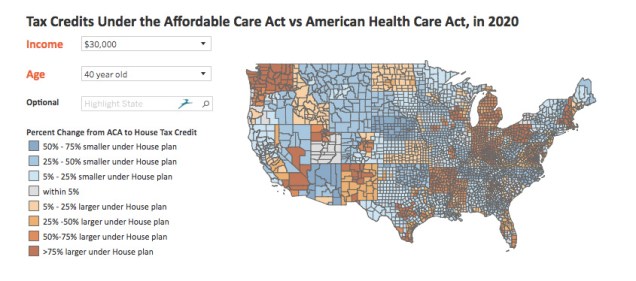
Their Interactive map provides county-and-state level comparisons of of ACA vs. AHCA tax credits based on age and income level.
Note: To try it out, click on the picture below to go to the KKF site. Once the new page opens, scroll down a bit to find the interactive map.
A related KFF report, How Affordable Care Act Repeal and Replace Plans Might Shift Health Insurance Tax Credits, includes the following charts, illustrating the effects of the GOP plan’s tax credits on individuals and families in different age and income groups in high and low cost states.
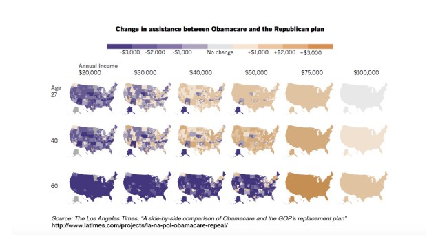
Many prominent news outlets cite KFF as a source for their illustrations. For example, last week, both The Los Angeles Times and The New York Times used similar graphics (in different colors) based on KFF data.
Another good set of illustrations of how the GOP plan might affect individuals at different income levels is provided in an analysis by The Century Foundation.
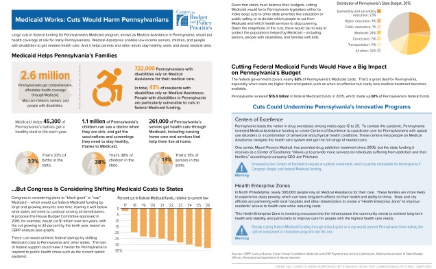
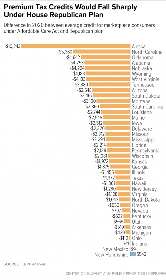
For a state-by-state comparison, the waterfall graph (below) from The Center on Budget and Policy Priorities (CBPP) shows the difference between the average ACA subsidy and the proposed AHCA tax credit.
Part II: Medicaid Expansion vs. Per Capita Cap
Coming Soon:
Part III: Individual Mandate vs. Penalty for Break in Coverage
Part IV: Cost Comparisons
Visualizing the U.S. Healthcare Delivery System, Before, During, and After the Affordable Care Act
Before they act to repeal, replace, or repair the Affordable Care Act, the Trump administration and GOP legislators should understand how the U.S. healthcare system currently works.
This is what our healthcare delivery system looks like today:

This is what it looked like before the ACA:

And how it might look in the future:
Notice what all three graphs have in common?
Health Insurers as Financial Intermediaries
Health insurers are at the center of the U.S. health care system, a position they are likely to maintain under any repeal/repair/replace scenario. Health insurance companies serve as the system’s financial intermediaries, meaning they act as the middlemen between those who seek healthcare and those who provide it. Money flows from consumers/patients/employers/governments to health care providers through health insurers.
Many people think the main role of health insurers is to act as gatekeepers to the health care system. Health insurance companies do manage access to health care services through their ability to approve or to disapprove payment for services (based on approval guidelines which may be dictated by private contracts or government regulation). But this secondary managed care role has grown out of the their primary role as financial intermediaries.
Health Insurance Markets
The U.S. health insurance marketplace is actually five different markets, each covering a different segment of the insured population.
In future blog posts we will delve into each of these segments in greater detail.
They are:
-
Group Health Insurance / Employer Coverage
-
Federal Employee Health Insurance
-
Individual Health Insurance (includes ACA Marketplaces)
-
Medicare
-
Medicaid
The first three markets (Group, Federal, and Individual) are administered almost entirely by health insurance companies (this includes third-party administrators of self-insured group plans). But health insurers can also act as intermediaries in the Medicare and Medicaid markets. While Medicare is considered a single payer system, Medicare beneficiaries can choose to be covered by a Medicare Advantage plan (also called Medicare+Choice or Medicare Part C), with premiums paid by the Medicare Administration. Medicare Advantage plans are primarily managed-care plans, like HMOs and PPOs, administered by private health insurers. Medicaid beneficiaries may also receive coverage through managed care plans. Medicaid managed care providers (insurers) contract with state Medicaid agencies to provide care for a set amount per member per month, with the premiums covered jointly by the Federal and State governments.
State Regulation
In the U.S., insurance regulation is primarily the purview of the states. How the states came to regulate the insurance industry will have to be the subject of a future post. You can also see what we wrote about the subject way back in 2003. State insurance regulation includes licensing, financial oversight, consumer protection, and rate-regulation. Before the passage of the Patient Protection and Affordable Care Act (PPACA) of 2010, aka the Affordable Care Act (ACA), aka Obamacare, the federal government had made limited headway into insurance regulation. Federal oversight of the insurance industry expanded with the passage of PPACA, along with the Dodd-Frank Wall Street Reform and Consumer Protection Act of 2010. But state governments still serve as the primary regulators of insurers operating in their states.
The consequences of state regulation are pretty obvious. Today, despite federal requirements for who and what services health insurers must cover, insurance companies still have to be licensed separately in every state where they operate. They cannot sell insurance across state lines (as some ACA replacement plans would like to allow them to do). Under the ACA, some states set up their own health insurance exchanges, while others (often for political reasons) chose to provide coverage through the federal marketplace. At this point we actually have four different types of ACA marketplaces (See below).
How well each of these state insurance markets operate is similarly varied. The steep premium increases (cited repeatedly by House Speaker Paul Ryan), affect some states much more than others. Likewise, the number of insurers offering marketplace plans vary by state. Next, add Medicaid expansion (32 states participate as of Jan. 2017) to this kaleidoscope of coverage.